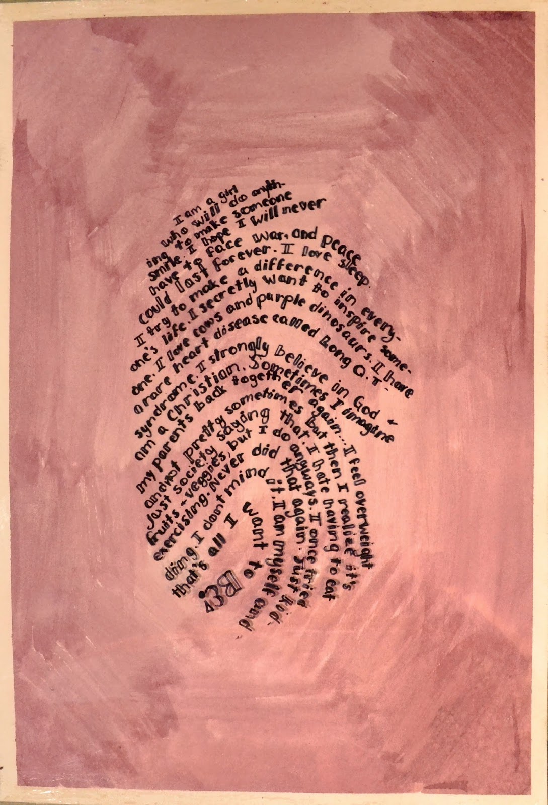
To make my actual piece I used the watercolours to make a textured look through the brushstrokes. This just really appealed to me. I really liked how my design idea turned out. I wanted purple (my favourite colour) and red (my second favourite) to be incorporated in my piece so I decided to mix the two. Doing that, I created a deep colour that I loved and I chose to do the ombre look with it. I chose the ombre look because it had the dark shades and light shades. The dark part on the outside represents my mind. It's crazy and busy, tied up thinking about what I wish would happen, or what I know I have to make happen. Its all over the place and all crowded, just like the deep mix takes up the outer area and the strokes crowd it. It gets lighter leading to the fingerprint. This, I believe, shows that inside I am happy with who I am. I am not dark and pushy, I am really a light, sweeter person who doesn't like it when things go wrong or when I upset someone. I think it shows through, in the way that my words do. I am pleased with my whole piece, but mostly with the font. I struggled to make my font design perfect since I had to make it so small, but it turned out great in my opinion.
I hope you like my piece as much as I do!
No comments:
Post a Comment